During 1893, a pharmacist created a unique beverage that featured a refreshing flavor and many natural ingredients. Caleb Bradham formulated a drink that contained lemon oil, nutmeg, water, sugar, caramel and cola nuts. The beverage eventually became Pepsi-Cola, which is a product that has become known the world over. Throughout the last 122 years, the business has created 12 versions of the Pepsi logo, and while the company was consistently developing new beverages, many designers modified the unique logo.
Creating Brad’s Drink and Designing the Logo
Before Caleb Bradham developed the invigorating beverage, he consistently helped clients who resided in New Bern, North Carolina. The pharmacist had created a drink that could improve attentiveness, optimize well-being and increase the satisfaction of customers. Once the pharmacist created the drink, he designed a logo that featured blue text and a unique border, and the ornate logo contained bold letters.
Offering Pepsi-Cola and Customizing the Logo
In 1898, the pharmacist created Pepsi-Cola, which is a trademarked drink that features a refreshing taste. Generally, the beverages could significantly improve digestion, and many individuals frequently purchased the distinctive beverages. During 1903, Caleb Bradham also redesigned the unique logo, and the logo contained red letters, a stylish font and an eye-catching design that could improve brand awareness. The image featured small spikes that accentuated the logo, and the image also had curved lines that were situated underneath the company’s name.
Throughout 1903, the company sold more than 20,000 gallons of Pepsi-Cola, and subsequently, the business swiftly expanded. In 1910, the company hired 240 distributors who were located in 24 states.
The owner decided to modify the logo in 1905, and the business softened the unique logo. The image still featured red letters, bold font and wavy lines; however, the company eliminated most of the red spikes that had accentuated the logo.
Redesigning the Logo and Creating a Recognizable Image
During 1906, the company substantially widened the logo, and the business increased the sizes of the letters. Moreover, the new logo slanted diagonally, yet the logo also featured the smooth lines that complemented the large letters. The company also promoted the trademarked beverage by adding extra text. These words were situated near the right corner of the logo.
Stimulating the Growth of the Business
During the 1930s, the company implemented innovative strategies that attracted many customers, improved the company’s reputation, reduced the costs of production and increased revenue. In 1933, the business significantly augmented the sizes of the bottles, and the company created a unique song that favorably describes the beverage. According to many reports, the song tremendously increased brand awareness, and the song described the cheap price of each beverage, the large bottles and refreshing flavor.
Evaluating Various Modifications
The business utilized the same logo for more than 30 years, yet in 1940, the company slightly altered the logo. The business increased the height of each letter, and the company widened the unique logo. The designers also reduced the sizes of the serifs that were connected to many letters. Additionally, the business eliminated extra words that had been situated underneath the main image.
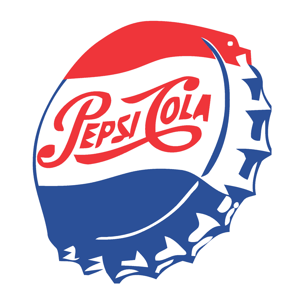
Designing an Excellent Logo That Resembled a Bottle Cap
Throughout the 1940s, the business consistently expanded, and the company promoted slogans that increased the popularity of the beverages. In 1950, the business created a distinctive logo that represented a bottle cap. The upper section was red, and the central section contained the name of the business. The lower section was blue, and the logo featured curved lines, an eye-catching image and a patriotic design.
During this time period, the company also developed innovative advertisements that featured large images, which showed many satisfied customers. Some advertisements also contained detailed descriptions that examined the benefits of the beverages, the refreshing flavor and the happy customers.
Eliminating Cola and Modifying the Design
In 1962, the business created a logo redesign that featured bold letters, yet unlike the other logos, this image contained plain letters that did not feature serifs. The business also removed a word from the logo, and simultaneously, the company redesigned the bottle cap that contained the company’s name. Moreover, the designers improved the symmetry of the logo, customized various types of advertisements and modified numerous slogans.
Altering the Sides of the Image
During 1973, the company’s designers removed the image that closely resembled the bottle cap, and the business added a large circle that featured the name of the beverage. The company also created a background that has a square shape, and this background considerably increased the overall size of the logo. In 1987, the business altered the font, and the bold font slightly widened the iconic image.
Restructuring the Logo
The logo remained unchanged until 1991, and during this year, the company placed the name of the beverage in the uppermost section of the logo. The designers also positioned a red banner near the bottom of the logo. The recognizable circle was situated in the right corner, yet the business had significantly decreased the size of the circle. Additionally, the company ensured that the name was italicized, and the designers slightly increased the sizes of the letters.
During 1998, the business quickly revamped the logo, and the company added a blue background. The designers also removed the large banner that had been situated underneath the company’s name, yet the circle remained in the right corner of the image. In 2003, the business created a three-dimensional version of the logo. This logo helped the company to advertise the beverages in movie theaters, and the business managed a marketing campaign that provided televised commercials, large billboards and digital advertisements.
Related: The process for trademarking a logo
Choosing an Image That Promoted the Refrigerated Beverages
When the company redesigned the logo, the designers added small images that resemble droplets of water, and these distinctive images represent condensation. Before the business approved the logo, the company also positioned the large circle above the name of the beverage. The enterprise unveiled the custom logo in June 2006, and the image featured a modern design, italicized letters and realistic graphics.
Examining the Modern Logo
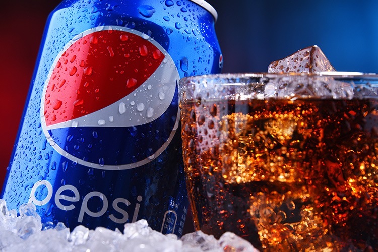
During 2008, the business hired the Arnell Group, which is a company that has created many distinctive logos. The designers repositioned the circle, modified the font and removed the serifs, and the modern logo featured lowercase letters and simple font. In 2014, the company removed the outline that surrounded the circle. Currently, the business utilizes this version of the logo, yet according to multiple updates, the company’s designers may modify the logo yet again within the next five years.
