The Denver Broncos, the NFL team based out of Denver Colorado, was established in 1958. Today the team has made a name for itself by way of the high-performing players and the fact that they have taken home 10 different championships since their inception.
Representative of their high performance, the Denver Bronco logo has included a Bronco (or horse.) In scientific terms, Broncos were actually extinct in 1996. The term refers to an actual type of course not a breed or species and they were first featured in rodeos where they were very rough animals prone to bucking. Horses are naturally very spirited and will buck for any reason such as being provoked by a rider, being surprised, or being scared.
The Denver Broncos mascot today is an Arabian gelding horse known as Thunder and thunder can be seen in some version or another on every Denver Bronco logo throughout history.
Who was involved in creating it?
The Denver Bronco logo from the 1960s was created by Edwin Taylor who sketched the uppercase d to help the team update their logo and sent it to them. He received a personal letter of thanks in 1968 from the Broncos organization.
When was it first made?
The original logo was designed in 1960, after the team was purchased by Bob Howsam as part of the American Football League. But there have been multiple changes to the Denver Bronco logo throughout history, each one arguably better than the last and all of them and compassing the same themes and emotions associated with the team.
How often was the Denver Bronco design changed?
The Denver Bronco logo has gone through five distinct phases over its history.
1960-1961
The original icon for the company started out with a cartoonish bronco or wild horse from the Colorado prairies in the middle of bucking, on top of which was a casual football player part of the Denver Bronco team. The horse had a saddle and the football player had cowboy chaps with a set of spurs on his boots in addition to his jersey and his football helmet. The colors were Brown and mustard yellow.
1962-1969
The color concepts changed to bright orange, navy blue, and white in 1962. In addition to changing the colors, the Denver Bronco logo replace the hand-drawn cartoon football player with a much larger American football player who is not riding the Bronco on a saddle but instead is standing on top of him, almost as if he is trying to tame the wild animal that is aggressively trying to knock football player off his back. The details in the lines got much sharper in this one and the player looks very optimistic, looking forward, holding the football in his hand behind him and maintaining control over the horse with the reins.
1969-1992
1969 saw an end to the Denver Bronco logo with any football player on it and instead focused on the wild animal. It was here that the team accepted the new logo using the same colors from the 1962 design with bright orange on an uppercase letter D inside the center of which is a dark blue background. Atop the dark blue background as though tucked behind the letter is a rearing Bronco in white exhaling steam from his nostrils. You can only see the upper body in this but it still paints a very clear picture of power and strength.
1993-1996
In 1993 that version was slightly modified. The same letter D in bright orange was maintained with its dark blue background, and the upper body of the Bronco clearly visible. The biggest changes to this version of the logo included a change to the Bronco itself. Instead of having a fierce, angry look in its eyes, they were replaced with black eyes, there were no longer any strips from the steam emanating out of its nose, and the mane was smoothed.
1996-Present
The present iteration removed the uppercase letter D but it maintained the same colors.
When was the most recent change made?
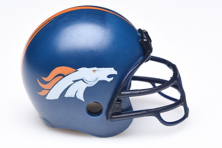
When Pat Bowlen took over the company it was decided that a new logo was necessary. Company representatives from Nike including Todd Van Horn, Ken Black, and David Odusanya were brought in to collaborate on this new logo. The actual mascot, a horse named Thunder, was used for this newest rebranding. The image encompassed the idea of fury and it showed a profile view of Thunder charging forward with a bright orange mane and bright orange eyes and the outline of his body in dark blue. The navy blue lines along its neck paint a clearer picture of the energy flow of a charging horse while the bright orange size depict the flames inside of the beast. This particular version remains the Denver Bronco logo today.
Ready to protect your logo? Read our guide on trademarking a logo.
Common trends & biggest changes
Fans will notice that the first two phases of changes throughout the history of the logo represent the biggest changes when, in 1970 the logo did away with having an actual football player present and instead focused entirely on having a Bronco. Rather than focusing on the power and strength of the football players, the logo took a turn toward focusing on the power and strength of a charging Bronco meant to represent that same power in each of their team members.
Tangentially, the common thread in the Denver Bronco logo is of course the Bronco itself. In all five phases of the logo development the team has enjoyed a Bronco either in the middle of bucking or charging, representing the strength, speed, and fierceness not only of the animal that of the players. It wasn’t until the latest change to the Denver Bronco logo however that an actual horse was used as the foundation for the design. The Denver Bronco colors of dark blue, orange, and white can also be seen throughout each version of the logo history since 1962.