When people see the Starbucks logo, they often think of a hot cup of coffee, a pastry or two, or an iced beverage that’s full of flavor. However, the Starbucks logo history contains a few other details that those who enjoy the company’s offerings might not know about the logo itself and the company.
Who Helped Create the Starbucks Logo?
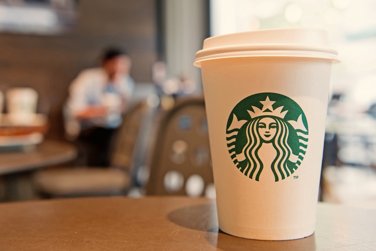
Terry Heckler is the name behind the design of the logo. While he was looking at marine books, he came across Norse. After careful observation and a few changes to the details, he crafted the logo after the two-tailed mermaid. The two tails can be seen on either side of the mermaid in the logo.
When Was the Logo Made?
The first Starbucks logo was created in 1971 shortly after the company was founded by Jerry Baldwin, Zev Siegl, and Gordon Bowker. The image behind the logo is a siren (mermaid) from the 16th century in a Norse woodcut. Over recent years, the logo has undergone changes to the shading and details of the design so that it’s a bit more universal. The design team initially thought about naming the company Pequod because the logo came about after reading “Moby Dick” and seeing that Captain Ahab’s mate’s name was Starbuck. Pequod was the name of the boat in the book.
How Often Has the Design Been Changed?
The first dramatic change of the Starbucks logo was in 1987 when the company was acquired by Howard Schultz. The brown was removed from the logo, and green and black were used. Tea and spices were also removed from the logo so that there was a plain image instead of one cluttered with words that viewers might not pay attention to when viewing the design. There was a slight change before 1987 and a major design change in 2011 when the logo was turned to a complete green design.
When Was the Most Recent Change Made?
In 2011, Starbucks decided that it should change the details of its logo so that it would appeal to all customers. However, the logo was met with a bit of disappointment from those who enjoyed looking at the black and green design with Starbucks Coffee along the edges of the circle.
The goal of the design change is to show that Starbucks offers more than just coffee, and is more than a simple coffee shop. Now, the only thing that customers see is the siren, a crown, and the tails on each side of her. The new design is one that the company believes is modern and that showcases the class of the business. When customers saw the new logo in 2011, they started complaining because they thought that it was confusing and that it would blend in with companies that offer similar products. There are no plans to change the current design.
If you haven’t already, check out our guide to trademarking your logo
Common Trends and Fun Details
The first Starbucks that opened in Seattle in 1971 only sold coffee beans. It didn’t serve prepared coffee like the company does now. However, most Starbucks businesses that are in the country now serve a large selection of beans of various flavors as well as hot and cold coffee.
Starbucks can be found in at least 50 countries with over 16,000 stores altogether. While many stores are located in large shopping malls, there has been a push in recent years for the company to build stand-alone businesses so that there is more space for customers to sit inside while they enjoy coffee or treats that are served. In the 1990s, there was a new store opening almost every day of the week.
There have even been Starbucks stores that have opened inside shipping containers. This usually happens when there isn’t enough space to open a full store or when a new store owner doesn’t want to tie into a large mall and risk being overlooked by customers. When the recession hit in 2008 and 2009, many people didn’t have the money to spend on coffee like they once did. This meant that the company hit the brakes on opening as many stores until the economy picked up once again.
Almost 800 stores closed around the world with many more on edge as they watched and waited to see if customers would start getting their morning cup of coffee before work or midday pick-me-up. A detail to keep in mind is that there are almost 70 stores in Manhattan that are within a few blocks of each other.
Starbucks is a company that wants its employees to make as much money as possible. One way that it accomplishes this is by placing tip jars on the counters in the stores. Customers are encouraged to leave tips for the baristas. However, some stores would spread the tips to all of the workers, including the managers. A judge in California ordered the company to pay $86 million to employees that had unfairly been distributed so that they would receive the money they deserved.
Baristas usually write the name of each customer on cups so that they remember who receives the order after it’s made. Now, customers feel welcomed when they get cups with their name as they feel that it shows that Starbucks employees care about each customer the same. Another detail about baristas who work for the company is that they must follow a specific dress code that includes a black or brown apron and a white shirt.