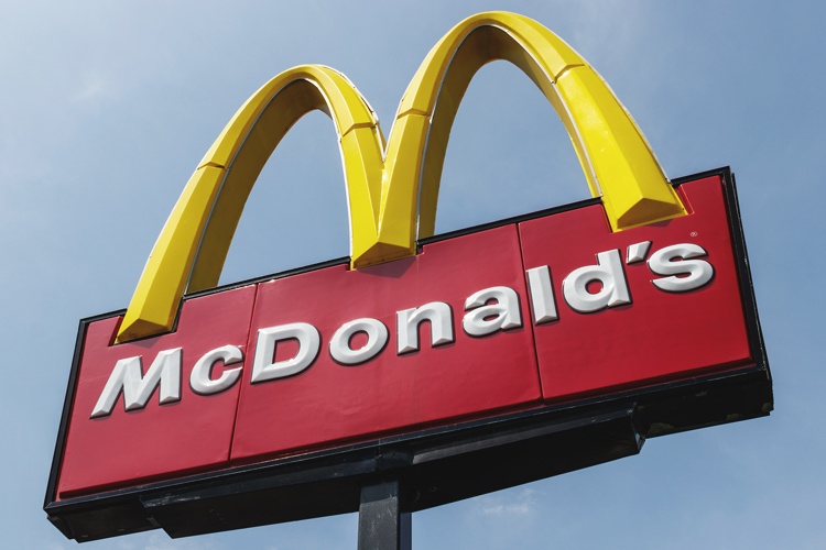
When you see golden arches, you probably think of McDonald’s. These golden double arches are among the most recognized symbols in the world. They point the way to a McDonald’s meal whether you’re in Iowa, Canada, the Philippines or France. How did McDonald’s come up with them? It all starts with a drive-in restaurant in the California desert.

Speedee and the Arch
McDonald’s began in 1940 as a small drive-in restaurant in San Bernardino, California. Brothers Maurice and Richard McDonald pioneered the use of a system that delivered hot food in seconds.
They called it the Speedee Service System, and it was only one of their innovations. They also pioneered a stripped-down menu that focused on only a couple of items and the use of disposable paper cups and plates.
Their sign boasted a smiling chef named Speedee as a symbol of the fast service you could get there. The brothers began using the Speedee System in 1948, and it turned their burger restaurant into a smash success. They had difficulty expanding to other locations, however.
Taking It Global
In 1954, salesman Ray Kroc was impressed when he saw the brothers’ restaurant in operation. He rightly predicted that the Speedee Service System and the stripped-down menu could transform the restaurant industry. Kroc took their ideas and used them to open many more restaurants under the McDonald’s name.
In 1961, he bought the brothers out for around $3 million, which would be worth around $25 million today. He also took ownership of the name McDonald’s. Kroc felt the name was more wholesome and all-American than his own name. By 1968, he had over 1000 franchise locations. Over the next few years, he began opening stores overseas. Today, there are over 35,000 McDonald’s restaurants in countries around the world.
How the Arches Became Part of McDonald’s
Kroc took something else from the McDonald brothers. When he met them, he learned about their dream to open a restaurant designed with a large, golden arch you could see from miles away. They wanted travelers on the highway to know where they could pull in for a quick, good meal.
The McDonald brothers asked architect Stanley Clark Meston to draw a plan for a building with a soaring arch beside it. Kroc later adapted this same design for his franchises.
By 1968, Kroc had purchased the rights to McDonald’s name, the rights to Speedee the mascot and the rights to the golden arch design. He began using them all immediately. He later replaced Speedee with Ronald McDonald.
Going from Single to Double Design
Kroc changed the arch from a single to double design in 1968. He asked his graphic artists to come up with a double arch that resembled the letter M. Kroc had always preferred the name “McDonald” to his own name. He thought it was wholesome and all-American. The original double arches featured an extremely rounded shape and a bright yellow color.
You can still see the original mascot and the single arch on a few vintage McDonald’s sings. The Downey, California franchise, which opened in 1953, was the fourth McDonald’s ever built and is the oldest one still in operation. It is one of a handful of locations that still sport the single arch and the Speedee mascot.
Golden Arches Become the Logo
It was only natural that the arches would become part of the corporation’s logo. The original McDonald’s logo featured the golden arches over the name McDonald’s in black lettering.
In 1975, McDonald’s placed a red background behind the golden arches. This was in keeping with McDonald’s trademarked colors of red and yellow.
This logo accompanied all McDonald’s advertising until 1997. In the 1980s and 1990s, McDonald’s had a series of highly successful slogans, including “It’s a good time for the great taste of McDonald’s.” Changes to the logo were minor during those years.
Read more: The process for trademarking a logo
I’m Loving It
In 2003, McDonald’s launched its wildly successful “I’m Loving It” campaign. Considered one of the greatest advertising campaigns in the history of marketing, it called for a new logo design. The corporation hired a graphic design company to redesign the arches.
The new shape was clean and simple. The name McDonald’s and the red background were gone. The design featured sharply pointed arches with a glossy surface and a dark shadow. The bold design matched the bold new advertising campaign.
In 2018, McDonald’s reintroduced a red background with a large golden M and no other lettering. The rebranding accompanied a major renovation of all McDonald’s restaurants. This rebranding softened the color schemes and added more mature elements to the restaurant interiors.
The 2018 logo is still in use today.
All McDonald’s franchise and corporate-owned locations must use the official logo and colors, but there is one exception. The McDonald’s in Sedona, Arizona, has a turquoise-colored arch. The city’s planning committee thought a yellow arch would clash with the natural beauty of the area.
Logo Lawsuits
McDonald’s has not had to fight much to restrict the use of the golden arches. Most of the company’s trademark and copyright lawsuits have centered on the use of the prefix “Mc.” The company has had massive victories and huge losses in this department.
The golden arches are probably so famous that nobody would dream of imitating them. If they do, they can be certain to face an immediate lawsuit. In the meantime, the next time you need fast food, you know you can find it under the golden arches.

