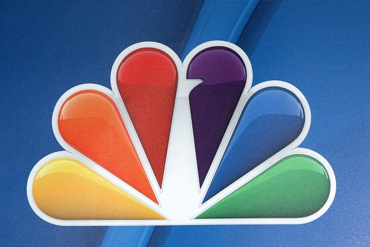
The National Broadcasting Company (NBC) is known for its peacock logo and its three-note chime. When you hear that sound and see that colorful bird, you know you’re watching NBC. NBC is a major force in network television. It’s the oldest broadcasting company in the US. The NBC logo has been part of the company’s role as an innovator in its industry for over 100 years.

Early Days in Radio
In 1926, the Radio Corporation of America (RAC) decided to start a radio station. The company hired David Sarnoff to manage it. Within a year, NBC was the go-to station for the major news and sporting events of the day. With a wide reach of affiliate stations and a commitment to the latest technology, NBC became a premier station almost from the start. The station was the first to broadcast the Rose Bowl, major heavyweight fights and key historic events.
In 1929, Sarnoff began using the famous three-chime note to signal that the station was about to broadcast. That sequence of notes is the first musical sequence registered as a trademark with the U.S. Patent and Trademark Office.
First Forays Into Television
The 1930s were the so-called golden age of radio, and they were good years for NBC. In 1939, NBC was among the first radio stations to enter the new world of television broadcasting. The station was the first to air the Macy’s Thanksgiving Day parade. In 1947, it aired the first televised World Series. NBC later moved its popular radio show Meet the Press to television. Meet the Press is still on television.
As part of the move to television, NBC unveiled the peacock logo for the first time. There were two reasons for the choice of this colorful bird. First, NBC wanted to establish itself as an innovator in color technology. Second, RCA manufactured and sold color televisions. The network’s parent company hoped seeing a brightly colored peacock would inspire more people to buy color televisions. In 1979, NBC officially registered the peacock as its logo.
Evolution of a Logo
In its early days, NBC sported a logo of a microphone shooting sparks across a map of the US. This was the station’s logo until 1931, when it changed to a box with the acronym NBC. Bolts of lightning surround the letters. The network later used this design on its TV station.
In 1956, NBC hired the design firm Sudler & Hennessey to come up with a new image for the broadcaster. Their designers created a peacock with 11 brightly colored feathers. Dubbed “the Bird,” this design coincided with the steep rise in color television programming.
In Living Color
The first peacock was animated. He first appeared in black and white and then transformed into 11 colors as you watched. A narrator intoned, “The following program is brought to you in living color on NBC.” It was a dramatic statement about NBC’s commitment to color technology.
The peacock is the network’s most famous mascot, but NBC also had an animated snake logo for a few years. Launched in 1959, the snake curled into the three letters of NBC’s acronym as the three chimes sounded. The broadcaster stopped using the snake in 1979.
NBC’s Logo Redesign
NBC kept the peacock for the next 20 years. In 1975, the company switched to a new design featuring an abstract box shape and no peacock. Just a year later, however, NBC faced a lawsuit from ETV, a Nebraska public television station. The Nebraska station alleged that the new NBC design was almost an exact copy of ETV’s logo.
In a settlement, a judge ordered NBC to pay for new broadcasting equipment for the public station. NBC also had to pay for the design of a new logo, new stationery and new signage for ETV. In return, NBC was allowed to keep the box design.
An Old Favorite Returns
After going through some unsuccessful design changes, the broadcaster conducted research into its brand identity. The research revealed that consumers still identified NBC with a beautifully colored peacock. In 1979, the company brought the peacock back.
This new peacock was simpler than the original one. It had only six feathers in bright primary colors. The designers placed the peacock on top of the letters NBC.
A Celebrity Peacock
In 2013, NBC redesigned the peacock to face left rather than right to symbolize that it was looking to the future. Aside from that, there have been no major changes to the company’s famous logo.
The peacock has become an iconic image in the US. During the NBC show Late Night with Conan O’Brien, host O’Brien would sometimes invite Polly the Peacock on the show. The peacock was actually a cardboard cutout of the famous logo who would make cutting remarks about NBC’s competitors.
NBC’s Copyright Lawsuits
Like many famous companies with a distinctive trademark, NBC has had to defend the use of its logo and marks.
In 2016, NBC sued a company that called itself NBCU Productions. The company borrowed NBC’s name, and that was just the start. According to the lawsuit, the defendants used NBC’s well-known trademarks in their email, letters, marketing materials, websites and more. NBC stated that the defendants were clearly trying to confuse customers and trading on NBC’s reputation.
Read more in our guide on trademarking a logo
Looking To the Future
NBC began its run during the golden age of radio and entered television when it was brand new. Today, NBC Universal owns 13 television stations and has affiliates in more than 200 markets. It is the oldest and largest television network in the US. The network’s future looks as bright as the colored plumes of its famous bird.

