The Pittsburgh Steelers are one of the most storied franchises in the National Football League (NFL). Since 1933, ownership of the team has remained in the hands of the original family. Under the Rooney family’s direction, the team became the first to win six Super Bowls. Among other things, the Steelers are famous for their unusual logos and their adherence to old-school football traditions. What is the history behind the logo?

Art Rooney’s First Franchise
The history of the team begins in 1933, when Art Rooney paid a $2,500 NFL franchise fee to create a Pittsburgh club. That may not sound like much for an NFL franchise, but in today’s dollars, it would be more than $50,000. Initially, he named the team the Pirates, which was the name of the city’s baseball team. This was a common practice back then.
The team’s early season was an almost unmitigated disaster. The Steelers couldn’t afford to hire top talent, and the team struggled. In 1936, Rooney hit it big at Saratoga Race Course, where he won $160,000 on a bet. Rooney used this money to hire the team’s first coach, Joe Bach.
The team also hired future U.S. Supreme Court Justice Byron White, who received what was then the largest NFL contract in history. White joined the Detroit Lions two years later. He joined another bench—on the Supreme Court–in 1962.
A New Era and a New Name
Rooney’s winnings kept the team going until 1941. Around this time, however, Rooney decided the team needed a new name.
In the tradition of many sports teams, the club held a contest for the best new name. A contest was announced in local media. Readers and sports enthusiasts offered hundreds of suggestions. Among the entrants that didn’t make the cut were the Wahoos, Condors, Pioneers, Triangles, Bridgers, Buckaroos, Millers, Vulcans, Tubers, Smokers, Rollers, Ingots and Puddlers.
Arnold Goldberg, who was the sports editor of the Evening Standard, was the first contestant to suggest the Steelers.
Town Built on Steel
The name was a natural fit for a town that had a long association with the United States Steel Corporation, commonly known as U.S. Steel. The company’s corporate headquarters have been in Pittsburgh since 1970, and its flagship building is the tallest skyscraper in the city.
From 1945 to 1961, the Steelers used the same logo on their uniforms and marketing materials. It was a football-shaped emblem with the words “Pittsburgh Steelers Football Club” framing a stylized view of the Pittsburgh skyline.
In 1961, it was time for a change. The team wanted to show a stronger association with the steel industry. To do that, the team adopted a version of U.S. Steel’s own well-known logo and colors.
The Steelmark
The U.S. Steel Steelmark, as it was known, was a gray circle around the word “Steel” and three starlike symbols in yellow, orange and blue. In advertising, the company said the three symbols mean, “Steel lightens your work, brightens your leisure and widens your world.”
In the 1960s, U.S. Steel allowed the American Iron and Steel Institute (AISI) to use the Steelmark. The AISI is an industry group that represents all steel producers. As the AISI explained in its own marketing, the three colors symbolize the materials used to make steel: yellow for coal, orange for iron ore and blue for scrap metal.
Related: Our guide to trademarking a logo
A Test Run
The Steelers petitioned the AISI for permission to use the Steelmark with the word “Steelers” instead of “Steel.” The AISI granted its permission, and the
The Steelers had a new name, a new uniform and a growing fanbase, but the team had doubts about the new logo. The team’s uniform helmet was gold-colored, and Steelers management wasn’t sure how the new logo would look on the helmet. They decided to do a test run by printing the logo on only one side of the helmet.
All discussions about the logo got lost in another discussion, however, when the team won second place in its conference and qualified for the 1962 Playoff Bowl. To celebrate, the team changed its helmet colors to black. This really made the logo stand out.
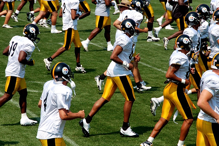
The logo was a hit, and the helmets kept their one-sided look. That tradition continues. Today, the Steelers are the only NFL team that places its logo on only one side of its helmet.
Subtle Changes
The Steelers logo looks like the original 1961 version. The team, however, has had to make subtle changes to keep a viable trademark on the logo. In 2001, for instance, the stars took on a thicker appearance, and the orange star became red. In other variations, the gray circle developed a thin black border.
For a short time during the 1980s, the team used the same logo but changed the script to a handwritten-style font.
In 2007, the Steelers introduced their mascot, Steely McBeam, to the world.
Sticking with Tradition
The Pittsburgh Steelers have lifelong ties to the city’s biggest industry, and the team’s logo reflects that history. They are among the oldest teams in the NFL. The only teams still playing who have been around longer are the Chicago Bears, Arizona and Saint Louis Cardinals, Detroit Lions, Green Bay Packers, Philadelphia Eagles and the New York Giants.
Ownership of the team remains with the Rooney family, and the uniforms and logos remain untouched from the team’s early days. Given the team’s love of tradition, there’s no doubt those traditions will continue.

