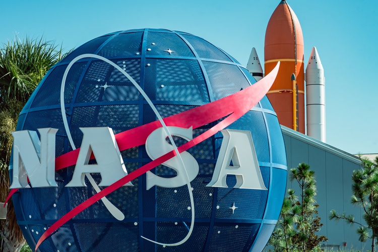
The NASA logo has gone through several changes. In fact, one of its designs came back after decades of retirement. Two of its best-known logos, affectionately known as the “meatball” and the “worm,” symbolize the optimism that underlies the positive view most people have of NASA.

A Moon and a Meatball
The 1969 moon landing is one of the most indelible moments in human history. It brought the National Aeronautics and Space Administration (NASA) into the public forefront as a government agency that represented the best of humanity. Staffed by some of the world’s best engineers, scientists and pilots, who share a commitment to literally reaching the stars, NASA is one of the most admired agencies in the world.
James Modarelli, a NASA graphic artist, designed the agency’s first logo in 1959. By today’s standards, it was a cluttered design that was hard to read. It pictured a yellow planet floating in a starry blue sky with a smaller planet circling it. The logo depicted a bright red chevron or vector that symbolized flight. The agency’s name appeared in a margin circling the design.
From Space Flight to Star Trek
In 1969, agency designers modernized the logo. They left a round blue circle with the letters NASA, the stars and the red chevron. It was clean and bright, and it was a hit. Agency staffers and the public referred to the new logo as the “meatball.”
The meatball made another appearance that only caught the eye of dedicated Star Trek fans.
In 1964, William Ware Theiss was a costume designer for the iconic TV show. When he designed the logo for Starfleet Command, he borrowed the red vector and starry sky from NASA’s meatball logo. The original Starfleet logo depicts a star-studded blue globe and a golden vector.
Modernizing the Logo
In 1971, President Richard Nixon launched the Federal Design Improvement Program. It charged government agencies with creating new logos that were easy to reproduce. The program also instructed the agencies to create standards for logo use and branding.
1974, NASA hired graphic designers Richard Danne and Bruce Blackburn to create a new symbol. Their firm had also designed the logo for the US Bicentennial celebrations.
In an interview with the design magazine Ceros in 2017, Danne recalled the excitement of that project.
“I think space exploration ranks at the very top of any human endeavor,” he said. “It’s almost the most stimulating challenge for man that I can think of.”
Creating Comprehensive Standards
Danne’s idea was to create a logo that was easily legible, easy to use and representative of the optimistic, upward drive he thought NASA represented. He and Blackburn removed the planet, chevron and stars. Next, they designed the NASA letters in a streamlined style in bright red.
The designers also put together NASA’s Graphics Standards Manual, which detailed the correct use of the symbol and how to use it on everything from stationery to NASA mugs.
The symbol won design awards and was warmly greeted by younger staffers. They liked the simplicity and technical precision of the new logo. It appeared on some of the era’s best-known spacecraft. To these employees, it represented forward rather than backward movement. Richard Nixon singled it out as a great example of the modernization he expected other agencies to follow.
It Wasn’t Universally Loved
Older NASA staffers, however, hated the stripped-down design. They dubbed the red logo “the worm” and said they wanted the meatball back.
In 1992, they got their wish. President George W. Bush appointed Daniel Goldin as the head of the agency. Goldin had worked at NASA during the meatball days, and he openly hated the worm.
When Goldin toured the agency’s headquarters, he asked what he could do to restore morale to employees there. Paul Holloway, director of NASA’s Langley Research Center, said he should “restore the meatball.” Goldin did so, and the meatball has remained in place ever since.
How Does NASA Protect the Use of Its Logos?
NASA has strict guidelines regarding how and when you can use its marks and logos. Since it’s a government agency, however, it can’t claim copyright protection under US law. Its content is largely considered public domain. You can still run into trouble, however, if you don’t give the agency credit or if you use its material improperly.
Here are some ways you can use NASA logos, graphics and material.
- Educational use: You can use content created by NASA to produce educational or informational materials without needing special permission. This guideline includes NASA photographs, videos, audiotapes and website content. It applies to both commercial and noncommercial uses. You should always credit NASA as the author of the material.
- Use of identifiable people: If the image you use depicts an identifiable person, you should get the person’s permission before you use it for commercial purposes.
- This is especially true if the person in the picture is well known. Contrary to what some people believe, celebrities’ images are not fair game just because celebrities are in the public eye. Most celebrities have what the law calls “right of publicity,” and you could end up being sued.
- Logos: You can’t use the blue meatball or the retired worm logo without express permission from NASA.
- Commercial use: If NASA content appears in a commercial setting, there must be no implication that NASA endorses the product or service.
Check our guide for more on trademarking your logo
Onward and Upward with NASA
NASA has faced many challenges in its long history. Despite these challenges, it is a powerful symbol of what people and governments can do when they put their best minds to work toward a shared purpose. Will the agency undergo another logo change in the future? Only time and space will tell.

