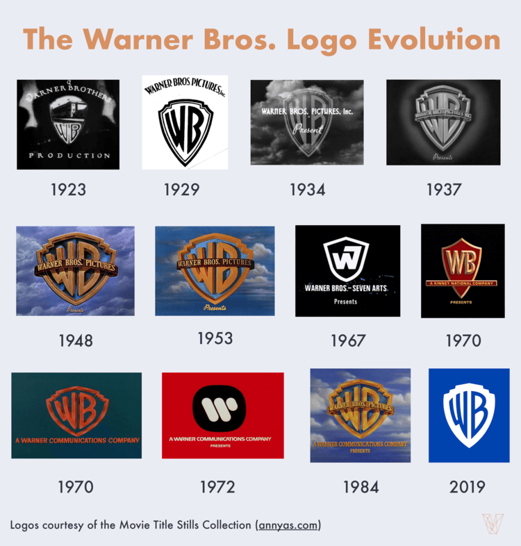
The large, retro-looking logo of Warner Brothers has graced movie screens for more than 100 years. The studio has released some of film history’s most notable movies, including Casablanca, Streetcar Named Desire, The Matrix and Batman: The Dark Knight. Warner Brothers is a multinational entertainment conglomerate with headquarters in Hollywood, but it began as a small studio founded by four brothers who loved movies.

Image courtesy of: Visual Objects
Born in Baltimore
Brothers Jack, Sam, Albert and Harry Warner were born in Baltimore. As young adults, they entered the movie business by purchasing a movie projector. They traveled to small towns in Maryland, Ohio and Pennsylvania to show movies in small local theaters. They were among the first to bring the movie The Great Train Robbery to these small towns.
In 1903, they opened their own movie theater in New Castle, Pennsylvania. In 1904, they established a film distribution company.
Move to Hollywood
In 1918, the brothers moved to Hollywood to open a studio on Sunset Boulevard. Their first movies included an adaptation of the popular book My Four Years in Germany and a film version of the famous Broadway play The Gold Diggers. In 1923, they incorporated as Warner Brothers Studio.
The studio’s first hits were a series of movies starring the dog Rin Tin Tin. One of the most popular dogs in movie history, Rin Tin Tin starred in some of the studio’s most successful films. Jack Warner called the dog “the mortgage lifter.”
Success at Last
Daryl Zanuck, who produced the Rin Tin Tin movies, became a powerful movie executive on the strength of those films. Zanuck became Jack Warner’s top adviser. The brothers then hired noted director Ernst Lubitsch as their head director.
First Logo
During these years, the company used a logo that vaguely resembled a shield. The shield featured the letters WB and a picture of the Warner Brothers studio building. The slogan “Classic of the Screen” ran along the bottom.
Except for some minor changes in the late 1920s and an overhaul in the 1970s, the studio has always used some version of a shield and the letters WB as its logo.
Related: Our guide to trademarking a logo
A Short Dry Spell
Despite the success of Rin Tin Tin, Warner Brothers remained a small studio without major stars or hits for several years.
In 1924, the brothers hired Broadway actor John Barrymore to star in the silent movie Beau Brummel. The movie was a hit with critics and the public. The success of this venture led to a long-term contract with Barrymore and gave the studio the clout to attract better talent.
By 1924, Warner Brothers was Hollywood’s most successful independent studio. The following year, the brothers established radio station KFWB in Los Angeles.
Synchronized Sound
Warner Brothers was an early pioneer in the use of sound in movies. In the early days of silent movies, movie theaters hired musicians to play the soundtrack live while people watched the film. Warner Brothers was one of the first to use the then-new technology known as “synchronized sound,” which added a soundtrack to the movie and didn’t require live musicians. The movie Don Juan, starring Barrymore, was one of the first to use this technique.
In 1928, the studio abandoned the shield for a logo that resembled a banner. The banner had the words “Vitaphone Corp.,” which referred to one of the studio’s subsidiaries. The rather messy design displayed the words “Warner Brothers Pictures” across the top, and “Present” in a different font. A small, stylized shield holding the initials WB is in the center. It is a confusing logo the studio fortunately abandoned a few years later.
New Logo
In 1925, the studio released a new logo that was simple and streamlined. Against a sky filled with clouds, a large shield with the letters WB appeared. This striking design was a departure from the studio’s more cluttered earlier logos. It is the basis of all subsequent logo designs.
In the 1940s, the shield became thicker and wider. The color version shows a deep blue sky and a gold shield.
Major Logo Overhaul
In 1955, the studio established its television unit. In 1958, Warner Brothers entered the recording industry. This proved to be a smart idea in 1962, when the studio released the movie My Fair Lady and the movie’s soundtrack at the same time.
In the 1970s, the studio released many major hits, including The Exorcist, Blazing Saddles, Deliverance and Mean Streets.
The 1970s also saw a major logo overhaul. Many companies redesigned their logos in the 60s and 70s, and Warner Brothers was among them. The shield disappeared. It was replaced by an abstract red W against a solid black background. An alternate version showed the shield in black and white and the background in red.
The Shield Returns
In the 1980s, Warner Brothers abandoned the modern logo it used in the 70s. It returned to a beautiful painting of a cloud-filled blue sky and a golden shield, similar to the version used in the 1940’s and 1950’s. This is, arguably, the iconic version of the WB shield.
A New Look
In 2019, Warner Brothers rolled out a new logo design, opting for a simple white shield on a blue background. While the logo is clean and simple, a study by Visual Objects found that only 11% of people prefer this new look to the classic shield. New isn’t always better, and most people seem to agree. Time will tell if the classic shield will make a return.

