YouTube is a video viewing platform that was started in 2005 out of San Bruno California. The very first video ever posted to YouTube was from the San Diego Zoo. Today it is the second most visited site around the world.
51% of people who use YouTube visit the site every single day with over 89% of users located outside of the United States and 37% of Millennials binge watching it every day, 70% of them from their mobile devices.
The most popular video on YouTube is the song Despacito from Luis Fonsi and it has over 6.6 billion views. Similarly, Justin Bieber’s music video for Baby has generated 11 million dislikes. With over 31 million YouTube channels, people watch videos on YouTube in over 100 countries, in over 80 languages. And yet, of that content almost 62% of the videos on YouTube cannot be viewed in Germany.
So what has made this website so iconic and so highly rated? The easily identifiable logo. The logo has always featured red, white, and black although in different hues.
Who was involved in creating it?
YouTube was originally created by Stephen Chen, Jawed Karim, and Chad Hurley, three former employees of PayPal. The company was created in 2005 as a video platform. At that time the original logo was developed by the founders of the company. It has become one of the most iconic emblems around the world, known by just about every person who has ever used the internet.
When was the YouTube logo created?
The YouTube service has been around since 2005 and its logo has been in effect since the same time.
How often was the design changed?
The YouTube logo has seen five changes to its design since the company’s Inception in 2005, however, none of them have been as stark or drastic as people see with other company logos. In effect, YouTube has maintained the same color pattern and the same general structure throughout the years.
2005-2011
The very first YouTube logo had a logotype that consisted of the name of the company split into the word “you”, in a simple black text with the first letter capitalized. The second half of the company name “tube” was written in white and it was located inside a three-dimensional, gradient rectangle that had rounded angles on all four sides. The first letter of the word was capitalized. The red screen was meant to be the shape of a television or a computer screen.
This general theme remained the same over the coming years and became known around the world.
2011-2013
For two years, YouTube changed the color of the logo doing away with the glassy texture found in the red rectangle and replacing it with a matte texture. Rather than having a gradient that was brighter at the top left corner, it had a darker gradient along the bottom of the red rectangle. This darker color palette gave it a much more serious design doing away with the cartoonish and fun three dimensional designs for which the company was originally known and focusing more on progress and power.
2013-2015
Two years later they went back to the bright colors of the original logo especially for the red rectangle, now featuring the brightest shade of red in YouTube’s logo history. However, there was no Shadow or outline around the second half of the word nor was there any type of gradient. The company still did away with the more cartoonish, three dimensional designs and instead replaced it with a plain and simple but somehow elegant design using the exact same typeface but changing the colors.
2015-1017
Two years later they redesigned the red shade inside the rectangle to be darker. This was meant to be more serious and strong then the previous iteration. It echoed some of the same changes seen in the second logo in YouTube history. However, the logotype was exactly the same and the composition remained exactly the same.
2017-Present
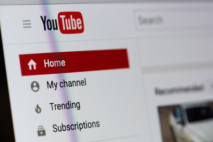
Today the newest logo is in place where no part of the company name exists inside of the red rectangle. The red rectangle is still present but instead of being on the right side of the logo it is on the left side of a logo, the first thing you see. The same typeface is used for the logotype, the name YouTube, with the same capitalization on the Y and the T. But this new emblem has a softened horizontal rectangle with no third dimension or gradient feature and instead, the white triangle facing to the right, indicative of a play but prominently in the center.
Read more on trademarking your business logo
When was the most recent change made?
The most recent change was that of 2017 when the name of the company was no longer split in the red TV or “tube” image, but rather, placed outside it.
Common trends with the YouTube logo
Over the years one of the most common trends you will see with the YouTube logo is the small red box and the black font. No matter what changes take place around them, YouTube has stayed almost exactly the same. The logo has been simple and iconic since the very beginning featuring what is, to the untrained eye, nothing more than a red box, but to any fan of the website, indicative of a television screen or computer screen or, in modern times, a phone screen.
The biggest change is to the most recent version that we have enjoyed since 2017 which features the single white triangle, the universal symbol for ‘play’ next to the logo. You might notice from time to time different takes on this icon like a black background behind the white words YouTube and the red rectangle or you might just notice the black words YouTube or the word YouTube in white against a black background. All of these serve as different takes on the same logo and can be seen as popular icons for multiple websites especially when linking two different YouTube videos on a personal website or a company website.