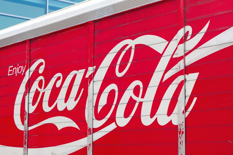
The color red and the scripted word Coca-Cola are worldwide symbols of refreshment and fun. The simple typeface, bright colors and consistency over time have turned this company’s logo into an unmistakable American icon.

The Perfect Recipe
In 1866, Atlanta pharmacist John Stith Pemberton perfected a blend of coca leaves, kola nuts, spices and sugar. He added carbonation to create a unique taste treat.
Pemberton was a good chemist, but he wasn’t a good marketer. Fortunately, he joined forces with a business partner named Frank Robinson. Robinson used the main ingredients, cola and kola, to create the drink’s name. He liked the symmetry of starting both words with C. He realized the name Coca-Cola would create eye-catching advertising.
Coke’s First Logo
Robinson also created the drink’s first logo. This simply said “Coca-Cola” in Spenserian script. This was a popular typeface for logos in the nineteenth century. Ford Motors used it to design the first Ford logos.
In 1887, Robinson filed a trademark for the name Coca-Cola and the logo. This version included a tiny TM trademark symbol in the white curve of the first C.
In 1890, Pemberton added curlicues to the design that looked like hanging ornaments. After a year, the logo reverted back to Robinson’s original design. It has remained largely unchanged since then.
Cokes Goes Nationwide
Initially, Pemberton only served Coca-Cola at his drugstore, where he offered it as a medicinal drink to cure stomach problems. He didn’t see any further business possibilities for his drink.
Others, however, clearly saw a future moneymaker. In 1892, Asa Candler bought the recipe for Coca-Cola from Pemberton. Like Pemberton, Candler was a former pharmacist.
Bottling Coke
Candler joined forces with Mississippi businessman Joseph Biedenharn to start producing the drink in other cities. Under Candler, Coca-Cola quickly became one of the most successful businesses of its time. By 1895, there were Coca-Cola syrup plants in Atlanta, Chicago, Dallas and Los Angeles.
Coke was now available in drugstores all over the country, but its expansion was just beginning. In 1899, Candler sold the rights to bottle Coke to Joseph Whitehead and Benjamin Thomas. This caused Coke’s popularity to soar.
During this time, many companies began making counterfeit Cokes. In 1899, Whitehead and Thomas developed its distinctive curved bottles to help consumers know they had a bottle of genuine Coke. The bottle shape known as the “Contour” has remained almost unchanged since then.
The 1940s
Coke evidently decided to stick with what works. The logo remained largely unchanged until 1941. In that year, the trademark symbol disappeared. In 1947, Coke trademarked the script it uses in its logo.
Red, Red Logo
Around this time, Coke unveiled another iconic symbol, the red disk. This round symbol with Coke or Coca-Cola in white lettering first appeared in Coke billboards. It then started showing up on the walls or windows of businesses that sold Coke. This served to implant the association of the color red with Coke even further.
During Christmas, the Coke advertising signs depicted holiday scenes like Santa drinking a Coke. That tradition continues. Besides Santa, the Coke polar bears appear in the company’s ads every holiday season.
Fashionable Fishtail
In the 1950s, Coke began adding a fishtail to the logo script. Reflecting the popular car styles of the time, this was a notched arch that appeared at the end of the letters C in Coke’s signs. It was a bold, eye-catching design that matched the car culture perfectly. The so-called fishtail logo lasted until the late 1960s.
The White Wave
For almost a century, Coke’s signs and advertisements showed a black logo against a red or white background.
In the late 1970s, Coke began using a white logo against a red background. It also expanded the width of the wings underneath both letters C in the logo.
This created a look similar to a wave or a ribbon. It had an official name, which was the Dynamic Ribbon Device. In this logo, the letters C have long, exaggerated tails that seem to form a wave or ribbon shape.
Coke Colors and Fonts
Coke’s official colors are red and white. The red color is not trademarked because it’s not a specific Pantone color. It is actually a blend of three reds.
The scripted Coca-Cola logo is trademarked, however, and so is the design of a white logo against a red background. These colors and the font have stayed consistent for more than 100 years.
Read more on trademarking a logo.
Variations on a Theme
Over the years, Coke has introduced new products and alternative versions of its original, iconic soda. The first was Diet Coke, which launched in 1982. Diet Coke became the number one sugarless soda in the world shortly after its introduction. Today, Diet Coke’s logo is the classic Coke logo on a silver background.
Other variations include Coke Cherry, which featured a deep cherry-colored can with white lettering, and Coke Zero, which was a black can with red and white lettering.
The New Coke Disaster
In 1985, Coke made a major mistake when it stepped away from its familiar traditions. The company changed its classic recipe and called it “New Coke.”’
New Coke was a marketing and public relations disaster. Consumers disliked the new flavor. Many said it tasted like the soda made by Pepsi, Coke’s biggest competitor. Sales hit record lows. In 2000, Coke reverted to its original formula, which it called “Coke Classic.”
New Coke disappeared, but the New Coke debacle has become shorthand for bad business decisions. It is considered one of the most self-destructive acts in corporate history.
A Century of Sweet Success
The pharmacist’s concoction that began as a medicinal tonic is now a global soft drink empire with annual sales of $37 billion. Its unique logo and signature bottle have helped establish Coke as an iconic soft drink for over 100 years.

