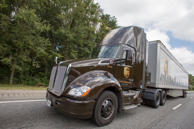
Few companies are as closely linked to one specific color as United Parcel Service (UPS), which is popularly known as “Big Brown” and whose advertisements once asked, “What can brown do for you?” This iconic connection to the color brown has become synonymous with the company’s identity.
The Atlanta-based United Parcel Service of America (commonly referred to as “UPS”) is the largest parcel delivery company in the world. The industry leader delivers over 4 billion packages each year to more than 200 countries. Besides a fleet of brown trucks (an element strongly associated with the brand), UPS has its own airline company with 500 airplanes.
UPS began as a courier service more than 100 years ago. Throughout its long history, the color of UPS and the famous sword-shaped logo have been inextricably linked to the company. Aside from a few modifications, the UPS brandmark and its brown uniforms have remained remarkably consistent. The consistent use of these elements has been a cornerstone of UPS’s branding strategy. The UPS brown color and Owens Corning’s pink stand out as two examples of companies able to trademark a color as part of their identity.
History of UPS and Its First Logos
In 1907, teenage friends Claude Ryan and Jim Casey of Seattle borrowed $100 from a friend to set up a new company. They called it the American Messenger Company, and it operated as a small messenger and courier service. Their first office was in the basement of their uncle’s tavern. At first, their employees delivered on foot and bicycle. By 1912, the company had its first delivery truck, which was a Ford.
As the business expanded, Ryan and Casey wanted their trucks to be painted in matching colors but couldn’t decide on the right shade.
In 1916, they hired manager Charlie Soderstrom, who came up with the idea to paint the trucks the Pullman Brown color. At that time, many trains carried the well-known Pullman Coach sleeper cars. These dark brown coaches were a symbol of power and elegance. Soderstrom suggested that UPS should use the color to create a similar image.
Soderstrom also pointed out that Pullman Brown would hide dirt better than other colors, an advantage for vehicles that covered vast distances. The company’s owners agreed, and they soon settled on the same shade of brown for their workers’ uniforms.
This choice of color laid the foundation for what would become a key aspect of UPS’s branding and eventually led to the trademark application and trademark protection of the UPS Brown trademark.
Read more on famous trademarked colors and how you can trademark a color
A New Identity
By 1916, the company had a new name: United Parcel Service. The first logo showed a golden shield with an eagle holding a package. This was the first appearance of the iconic shield. Over time, the shield became simpler, as founder James E. Casey believed a single shield perfectly symbolized strength.
In 1937, the acronym UPS first appeared on the logo in brown and gold, colors now central to the UPS brand.
Adding a Parcel
In 1961, UPS commissioned renowned designer Paul Rand to redesign its logo. Rand was one of the world’s foremost graphic designers. He designed the logos for IBM, Westinghouse, ABC broadcasting and many others. He also created a new logo for Ford Motors, but Henry Ford, Jr., decided it was too modern and never used it.
Rand’s redesign added a humorous element to the shield symbol by adding a wrapped parcel on top of the shield. Rand changed the colors to black and white. The font he used is a trademarked font called UPS Sans.
Rand once said, “I don’t think one can design for permanence. One designs for function, usefulness, rightness and beauty. Permanence is up to God.”
All the same, his much-loved parcel logo lasted until 2003, when the company again changed the shield to better reflect its services, which have expanded far beyond simple parcel delivery. The redesign removed the wrapped parcel and reverted to brown and gold.
Read more on trademarking a business logo
Sticking With What Works
Over the years, UPS has shown fierce loyalty to its trademarked color and logo design. Executives intermittently considered changing UPS Brown, but market research showed it would be disastrous for the company’s brand.
In 1998, UPS officially filed a trademark for two registrations related to its UPS Brown trademark. One trademark registration defined UPS Brown as the company’s official color. The second trademarked the color brown for use in delivery services and prevented other delivery companies from using the same color. This historic move demonstrated that it is indeed possible to trademark a color when it acquires secondary meaning in connection with a company’s goods or services.
Legal Battles to Protect Big Brown
While United Parcel Service has not faced many significant legal battles, it has defended its trademark rights in smaller skirmishes.
In 2019, UPS filed a lawsuit against three companies with similar names: United Pot Smokers, UPS420.com, and UPSgreen.com. The lawsuits cited trademark infringement, false advertising, and unfair business practices, claiming these companies’ use of the UPS letters and shield logo were confusingly similar to UPS trademarks.
UPS argued that these companies violated its rights under trademark laws and caused harm to its reputation.In 2020, UPS filed a trademark for UPS HEALTHCARE, signaling the company’s expansion into specialized delivery services for medical supplies. The application, filed with the Patent and Trademark Office, reflected UPS’s role in delivering essential medical products during the COVID-19 pandemic.
The Shield Stays Strong
While UPS has added new services and slogans like “We love logistics” and “United problem solvers,” its unchanging UPS Brown trademark — including the shield logo and the UPS trademark the color brown — has reinforced the brand’s stability.
The color brown, chosen by Soderstrom, and the unwavering UPS brandmark continue to represent reliability and trust. This color trademark and visual identity are central to UPS’s success as the global leader in parcel delivery.
For a company like UPS, consistency is key. The loyalty to Pullman Brown — now UPS Brown — shows the power of a unified visual identity in building and maintaining a brand. When it comes to colors, registering a trademark for a specific color like UPS Brown proves how powerful branding can be in today’s marketplace.