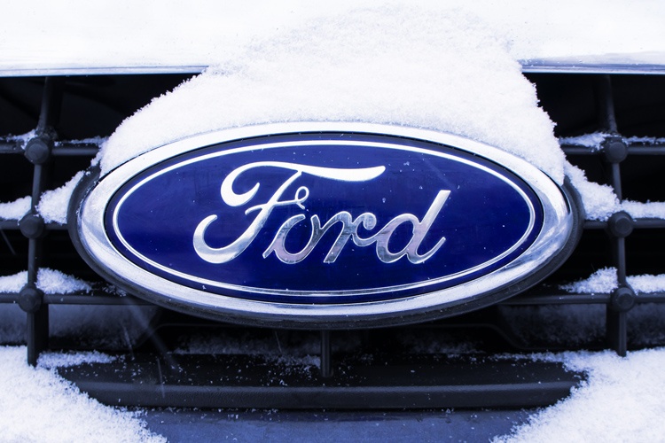
The Ford Motor Cars logo is one of the most iconic corporate symbols in the world, right up there with the Coca-Cola logo and McDonald’s golden arches. What’s interesting is how long the simple, memorable design has lasted. The logo has remained virtually untouched for over a century.
Henry Ford started Ford Motor Company in 1907 after two unsuccessful attempts at establishing an automobile company. His persistence paid off, and his third company was wildly successful. Ford Motors became profitable just a year after its founding, and it has remained one of the most popular car brands in the world.

Stencils Created a Simple Design
The design originally came from Childe Harold Wills, a longtime friend of Henry Ford who joined the company as a metallurgist and chief designer in 1907.
At the time, the company’s logo was an intricately designed, Art Nouveau style badge with the words “Ford Motor Co., Detroit, Mich.,” inscribed on it. This emblem appeared on all the early Ford cars and trucks.
The First Logo Was Very Different
When Willis came on board, he decided to simplify the emblem. He removed all the intricate detailing and simply wrote the word FORD in fine calligraphy on a white background with no oval. Willis’s father was a business card designer, and Willis used his father’s stenciling set to create the slogan.
Henry Ford liked the the design, which was elegant and quite modern for its day. Willis’s design first appeared in 1907. Willis later added a black circle around the letters but kept the background white.
The Winged Pyramid Appears
In 1912, a group of designers at the Ford thought the simple, lettered Ford logo needed a redesign. They kept the original lettering but placed it inside a winged pyramid. The background was a bright blue color, and the design looked something like a stylized bird. The slogan read, “Ford: The Universal Car.”
The Blue Oval Returns for Good
Although he approved of the pyramid initially, Ford soon decided it wasn’t right for the company’s image. In 1927, he asked Willis to work his magic again. Willis came up with another simple, elegant design. He placed the single word “Ford” on a blue background inside an oval. The oval had a steel rim. The first car to sport it was the 1927 Ford Model A.
This design had remained almost untouched since then. The company now refers to this design as the Blue Oval. Although the automaker has made a few changes, it has never overhauled the design.
Some Changes Weren’t Successful
Some changes have worked better than others. In 1957, the company changed the oval by adding straight lines to create an almost hexagonal shape. Most design historians agree this was a major design misstep by the automaker.
Paul Rand Steps Up
In 1966, Henry Ford II hired designer Paul Rand to revamp the logo. Rand was one of the world’s foremost corporate graphic designers. He created the logos for ABC, IBM, Enron, UPS and Westinghouse.
In Rand’s design, the lettering was slanted and modern. The oval became a rectangle, and the background color was a lighter blue. It was a very modern, sleek design, but Henry Ford II rejected it. He wanted to modernize the logo, but Rand’s version was too radical a departure.
The Blue Oval was here to stay.
A Sophisticated Centennial Logo
In 2003, Ford celebrated its centennial with a logo that had slight changes. The oval shape became slimmer and the background was a gradient blue. This was a sophisticated design that remains one of the company’s most successful logo upgrades.
None of these changes were a complete overhaul of the basic design, however, and the Ford symbol remains surprisingly similar to its original incarnation. You can easily recognize it on Fords from almost any year.
Ford Almost Lost Its Logo
In 2006, Ford was suffering like the rest of the automotive industry. Rather than take a bailout, Ford’s then-CEO Alan Mullaly made an agreement to borrow the money to save Ford. The agreement called for Ford to sell several of its trademarks if Ford defaulted on the loans.
Among the trademarks Ford risked losing were the Mustang, the F-150 and the famous Ford logo. Fortunately, the company never had do this. Ford was able to stay in business and become a profitable company again. Through it all, it held onto the Blue Oval and its other assets.
Related: Our guide to trademarking your business logo
Iconic Logo and Legendary Slogans
Ford doesn’t just have one of the world’s most iconic logos. It also has a slogan that has remained unchanged for more than 30 years. Every advertisement for the Ford F-150 series reminds us that these trucks are “built Ford tough.”
That simple, three-word slogan was first introduced in 1979, and Ford has never stopped using it. Since the F-150s are by far the best-selling trucks in the world, the company sees no reason to change a winning slogan.
Ford’s approach to advertising conveys an attitude of, “If it ain’t broke, don’t fix it.” It seems to be working well for the auto giant.

